Worst Websites To Shop On
Photo from curiouslyconcious.com.
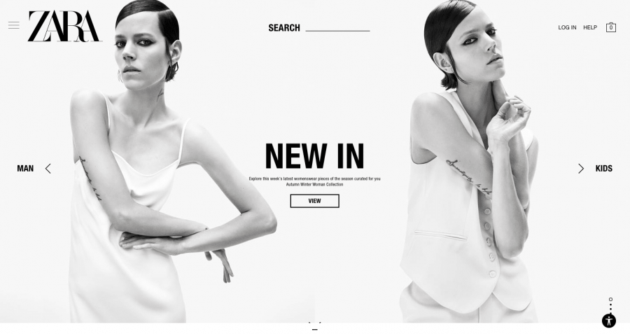
The Zara Website’s main page is anything but easy to navigate.
April 30, 2021
If you’re anything like me, carelessly pressing ‘add to cart’ on my free time is the ultimate idea of fun. Nothing’s better than a little online shopping, especially when you have no intentions of ever pressing ‘check out.’
As trouble-free as online shopping sounds, some brands have taken a more…demanding approach to their website arrangements. Now, don’t get me wrong, I’m all for personalization and even a bit of eccentricity, but by that I mean a few color pops, not a thirty-minute hunt to find a pair of jeans.
Given my negative experiences with complicated websites to shop on and the philanthropic mood I’m in, I’ve decided to compile a list of stores you’d be better off driving to than ordering from online.
- ZARA
Whoever coded the ZARA website should be in charge of national cybersecurity. Looking for a pair of pants? No. Here’s a picture of a model doing a backbend instead. Not once have I left their website with what I needed (or anything at all, for that matter), and the online shopping experience does no justice to purchasing their clothes in-store.
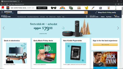
- Amazon
Contrary to popular belief, it’s actually quite hard to shop on Amazon. You can’t just buy miscellaneous things on Amazon, but you’ve got to have a specific item in mind before going on the website and purchasing it. Not only that, but their options for almost everything are limited, and the Amazon’s Choice label on some items when its competitors are cheaper and have better reviews really throws me for a loop. Like, what makes an item Amazon’s Choice then?
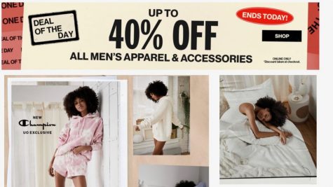
- Urban Outfitters
See, I have mixed emotions about the Urban Outfitters website. In one hand, you have a cool, hipster-style layout with a few models posing strangely, but it all still works in some way. On the other hand, there are sections of the website like, “Desert Dreaming: New Out From Under,” that don’t really make sense. No, Urban Outfitters, I’m not going to wear a grey hoodie and sweatpant set in the desert (if that’s even what they’re trying to say?). Also, similar to Amazon, finding items on their website alone is hard.
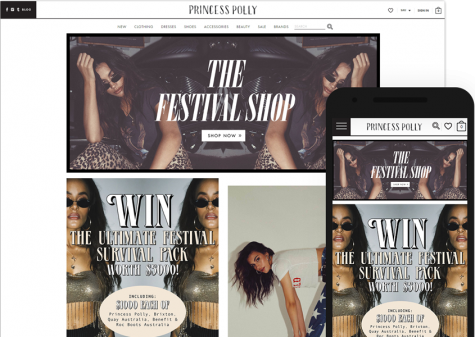
- Princess Polly
Rarely do I say a website’s layout is too much, but the Princess Polly website layout is too much. First of all, the website colors have a very sharp contrast, and second, the website has an annoying feature where if you even slightly move your mouse, it will automatically click on the button it’s hovering over. You can be nine pages deep into the dresses section, and then all of a sudden, you’re back to the main page. I’m not sure if Princess Polly has in-store shopping, but for easy online shopping and cuter, more unique clothes, I’d visit UNIF or Society Vintage.
There you have it, folks. Save yourself the hassle and avoid online shopping on these four websites. You can thank me later. Happy shopping!

